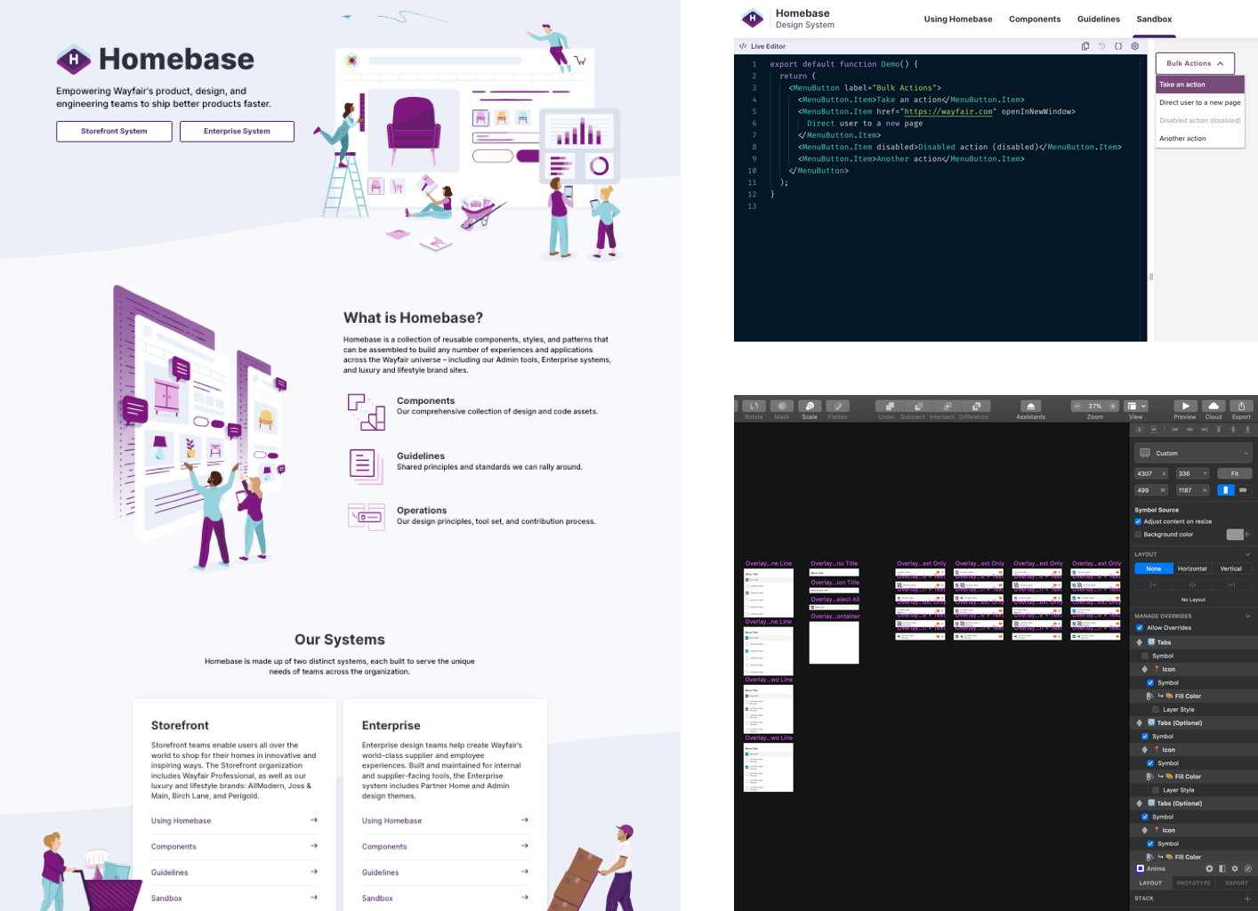
Wayfair Homebase
Homebase is Wayfair's design system that supports a suite of internal and external products.
In 2019, the Homebase team successfully revamped the system for storefront XD, transforming sticker sheets into a comprehensive repo of style guide, usage guidelines, Sketch assets, and code assets for components.
However, the system for enterprise tools (Admin and Partner Home in Wayfairian lingo) still lags.
In this 3-month project, I led the initiative to rebuild our system into a single source of truth that is consistent, useful, usable, and lovable.
Confidential information in this case study is omitted and obfuscated.
The content in this case study does not necessarily reflect the views of Wayfair.
Identify the Gaps
I started with a thorough comparative analysis of the system against the storefront counterparts and other open-source design systems, which helped uncover the gaps with both internal practices and industry standards.
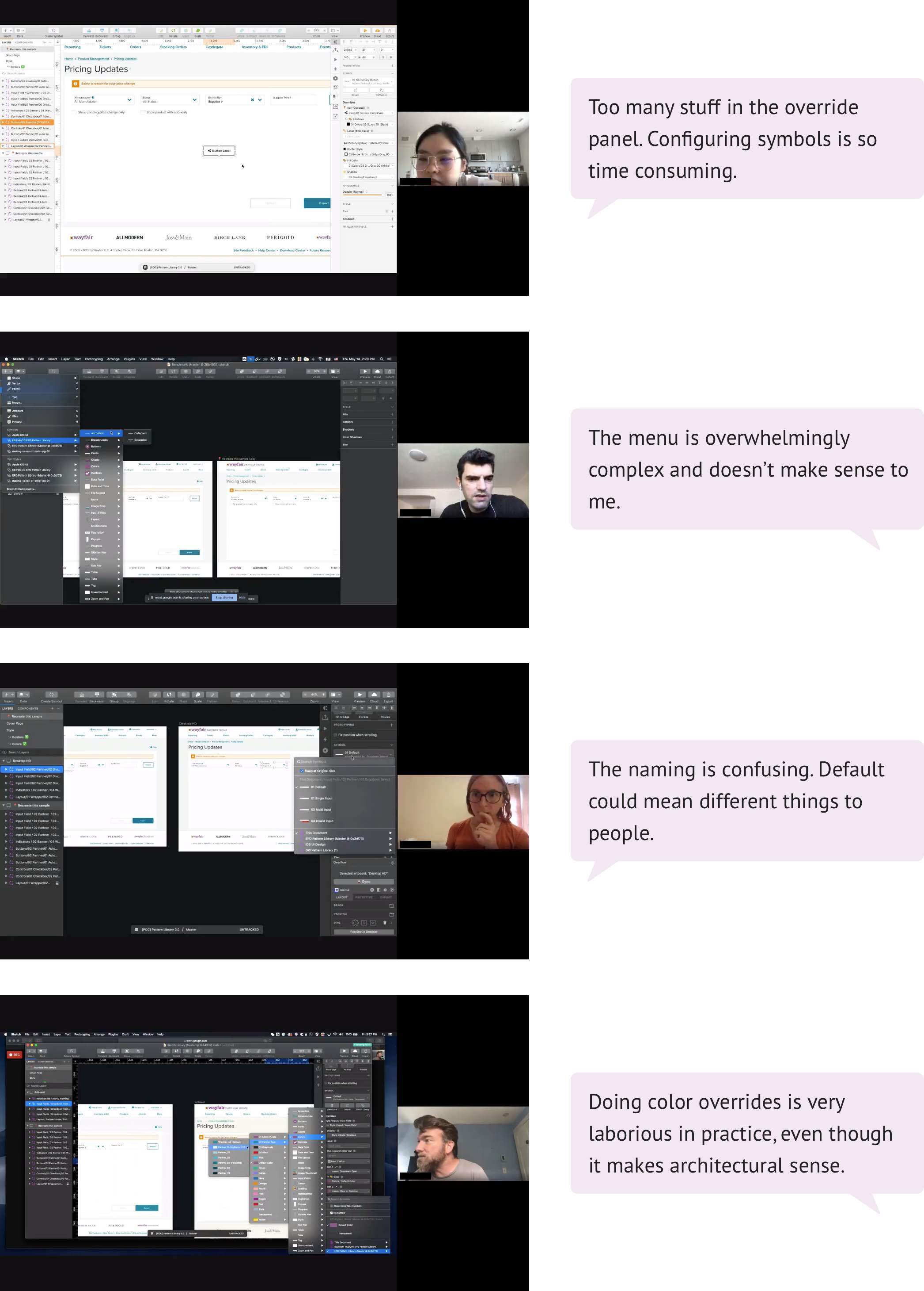
Pairing with the evaluative research, I conducted contextual inquiries to observe designers use the Sketch library in their job. Watching how they accomplished certain things and stumbled on others revealed many insightful moments.
After a series of user researches, I worked with the team to synthesize our findings into three user stories:
- Homebase design assets and code assets should have 100% parity, so designers feel confident that their design accurately translates into production.
- Sketch library symbols should reflect their usage guidelines and editorial guidelines, so designers have a quick reference while building their mockups in Sketch.
- Designers want a carefully organized component menu, so they could find a particular Sketch symbol out of the massive selection quickly.
The user stories are the north star that guided me through this project with a laser focus on solving user pain points.
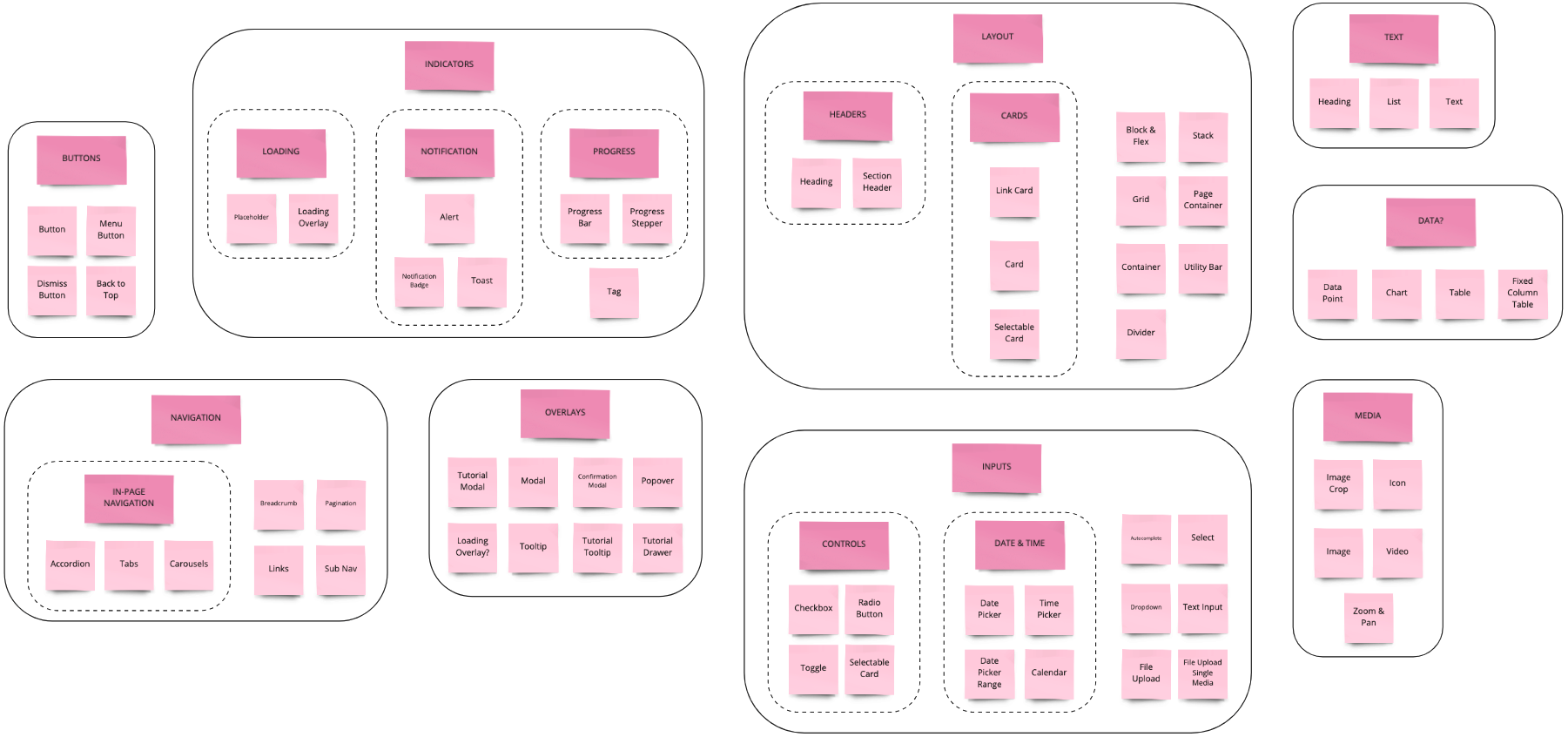
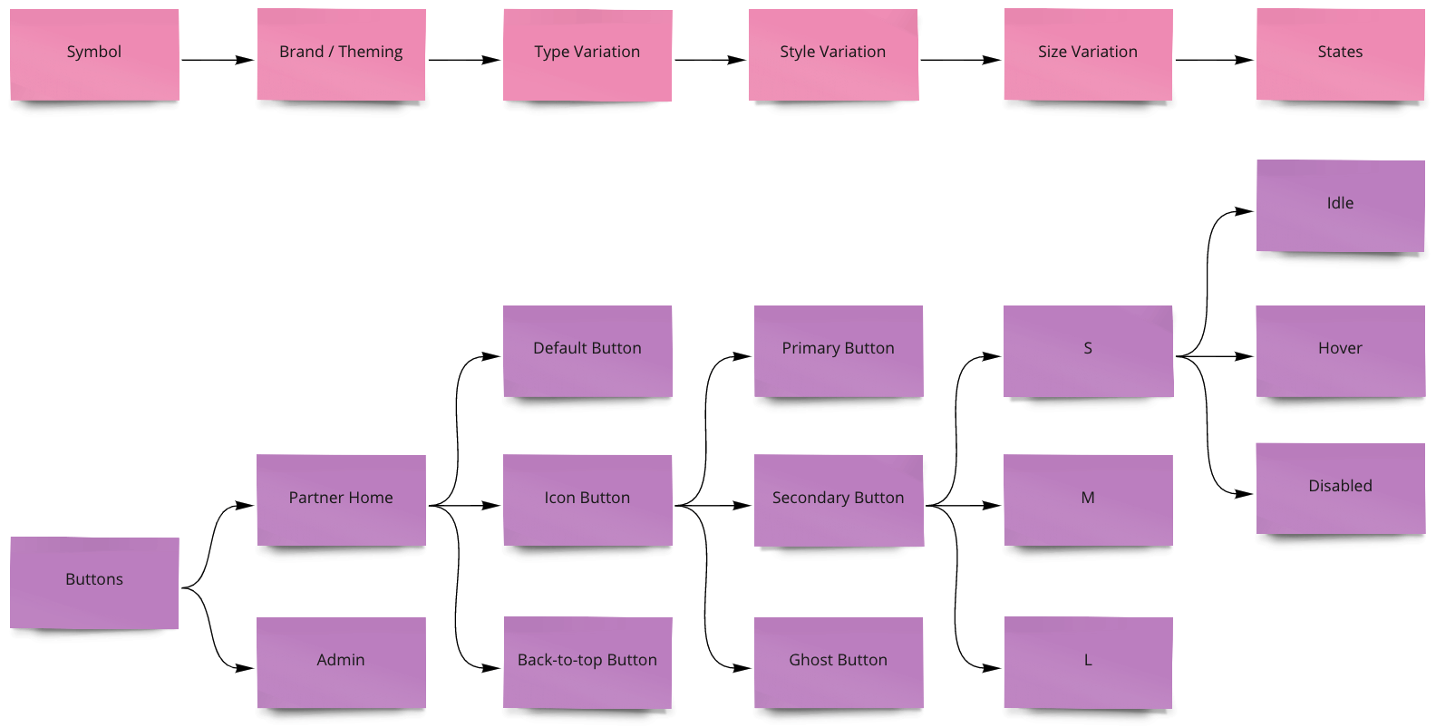
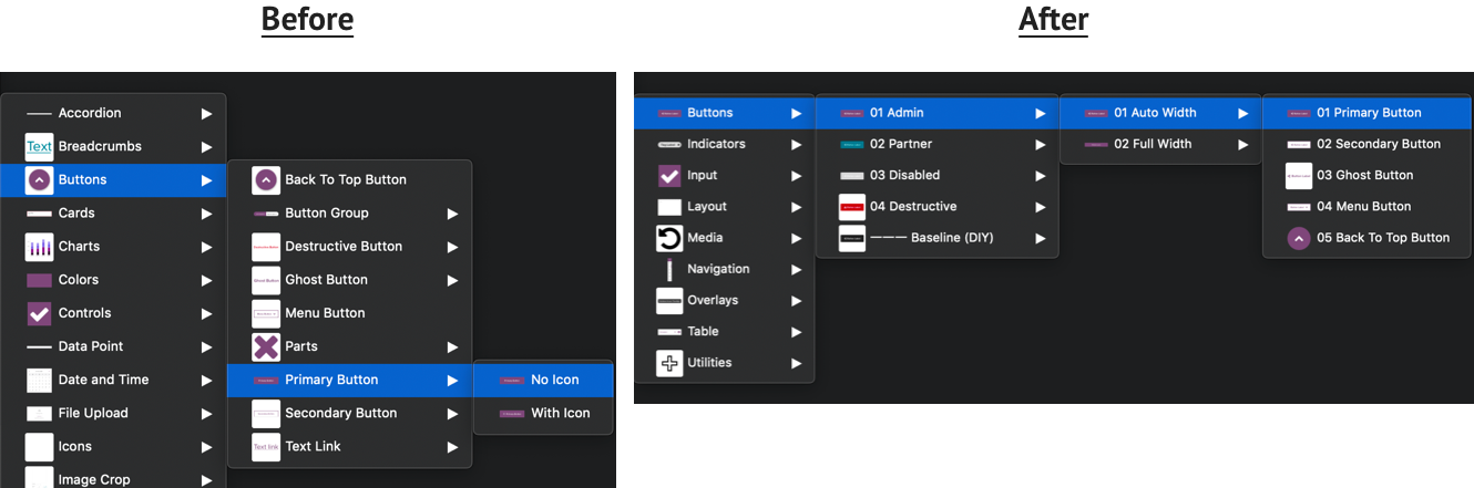
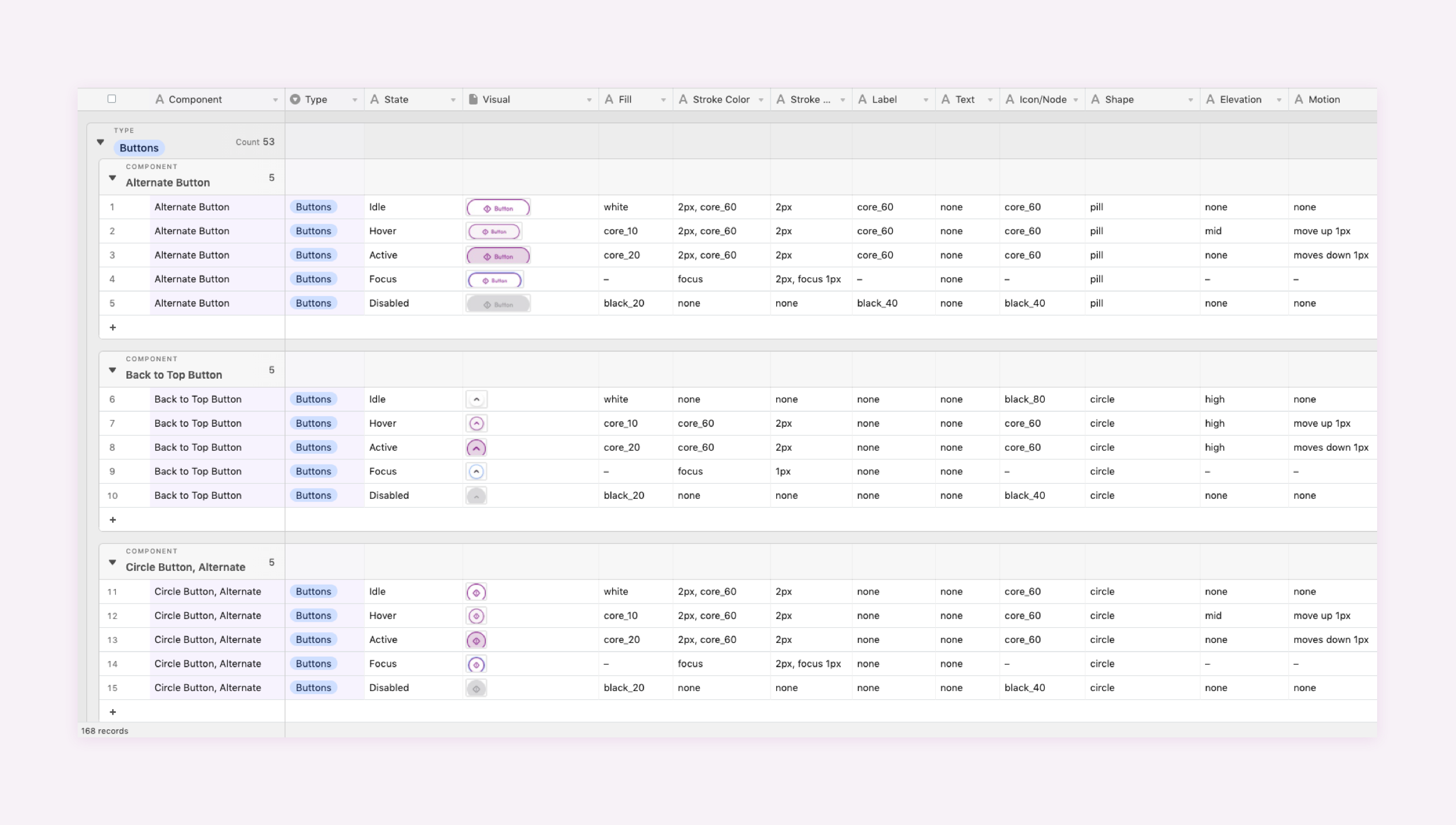
Menu IA
The Sketch library uses a flat menu structure and organizes components alphabetically, making it difficult to navigate.
I collaborated with a content strategist to generate some archetypal category names. Using those takeaways, I then facilitated a hybrid card sorting with seven Homebase users, which helped me uncover a meaningful grouping of components. The new taxonomy shifted our menu from a flat IA to a logical and hierarchical one.
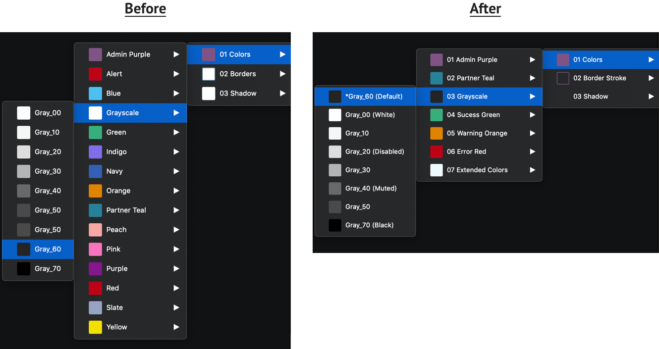
To address the color overrides complication, I re-organized system colors by their semantic usage. The color roles are also clearly labeled for easy mapping and reference.
Sketch Update
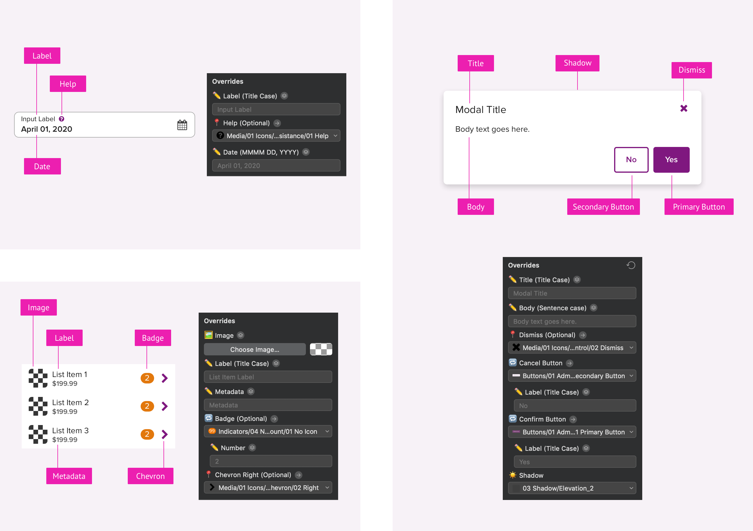
Every Homebase component behaves and functions in specific ways. The text input has a fixed height, while the text area is flexible in its size. I want to ensure that Sketch symbols reflect these guidelines.
I spent two weeks and rebuilt over 100 Homebase components to align with:
- Resizing constraint (fixed size vs. auto-size vs. flexible size)
- Override setting (show vs. hidden, and required vs. optional)
- Editorial specification (text alignment, letter case, and data format)
UI Parity
From an audit between design and production, I uncovered all the major discrepancies, which are tagged as:
- Design-driven, which is fixed in the new Sketch file;
- Code-driven, which is taken care by the engineering team in the code monolith, repo for decoupled apps, and Homebase site;
- Rendering-driven, which is partially fixed. For example, we adjusted the anti-aliasing in CSS to minimize the font-weight discrepancy.
User Testing
To gauge the effectiveness of my work, I designed and conducted a within-subjects test, where participants were asked to recreate a design comp using both the v1.0 library and the updated v2.0 library.
In this test, Sketch libraries are the independent variables, and the task completion time is the dependent variable to be measured.
Selected participants were randomly assigned into two groups. To minimize order effects, group A used v1.0 first and followed by doing the same task with v2.0. Group B did it in the reverse order.
Both groups provided positive results. On average, task completion time is 16% less when using v2.0.
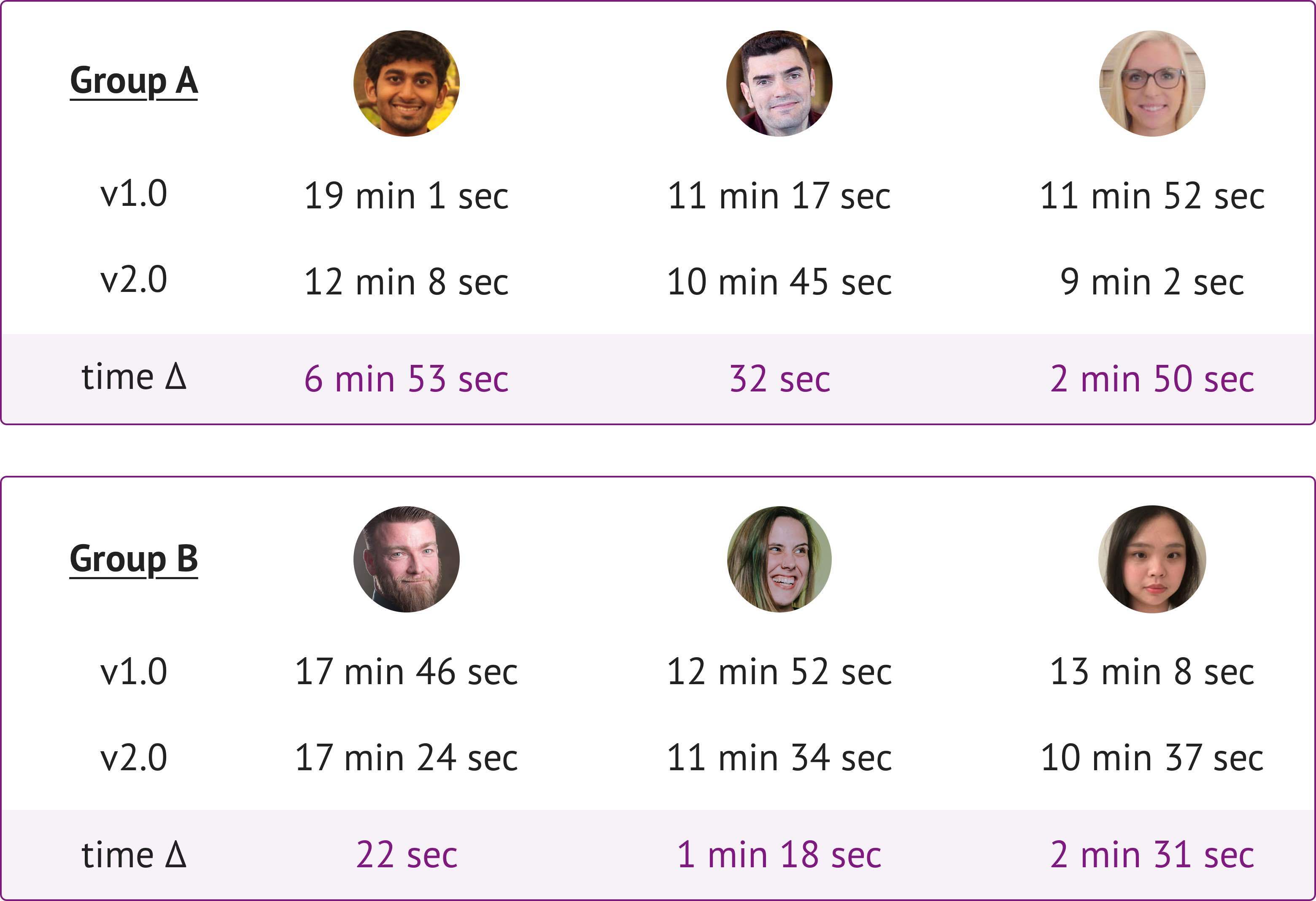
On average, the time on task is reduced by 16%.
—
Outcomes
After another around of finessing, I beta released the Enterprise Product Design (EPD) Library v2.0 and did a virtual presentation in our monthly Show & Tell on July 1, 2020.
There are three main takeaways from this project:
Overcommunication makes you heard. Cross-channel communication makes you understood.
People are naturally against change. They tend to stick with the old version, even when the new one performs better based on research.
Building a robust design system is about striking a perfect balance between flexibility and cohesiveness.
At the time of writing this case study, I'm working on a master plan to retire the v1.0 library and migrate enterprise designers to the v2.0 in a graceful and phased approach.